

CollectEarly
Helping small business owners access cash faster with confidence.
FINSYNC
Responsive Web
Background
Problem overview
Small business owners often need cash immediately, not weeks after sending an invoice.
CollectEarly was designed to give entrepreneurs early access to invoice payments, but the original onboarding experience created confusion. Requirements were unclear, credit limits felt abstract, and users struggled to understand whether they qualified or what steps remained.
As a result, many users dropped off before completing setup or hesitated to trust the credit information presented to them.
The opportunity
Early access to funds requires clarity.
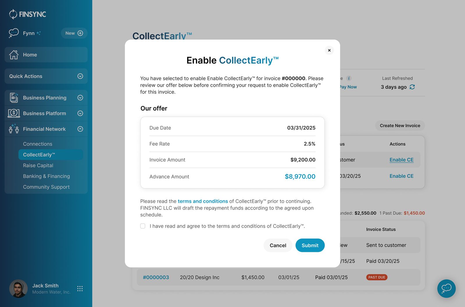
For CollectEarly to succeed, users needed to understand what was required, why each step mattered, and how their credit limits were determined. The experience had to feel transparent and predictable so business owners could move forward with confidence.

What I did
I partnered closely with the underwriter and product manager to redesign the onboarding experience from end to end.
Focus areas
1
Simplify setup
Reduced friction by clearly sequencing required steps so users always knew what to do next.
2
Show progress
Introduced a progress tracker that surfaced completed and remaining tasks, helping users feel oriented and in control.
3
Explain requirements
Added plain language guidance under each step to clarify why information was needed and how it affected eligibility.
4
Clarify credit limits
Redesigned credit limit displays to feel transparent and understandable, reducing uncertainty and doubt.
5
Centralize tasks
Created a single hub where users could manage invoices, customers, and funding status without jumping between screens.
Implementation
Desktop screens
Onboarding flow
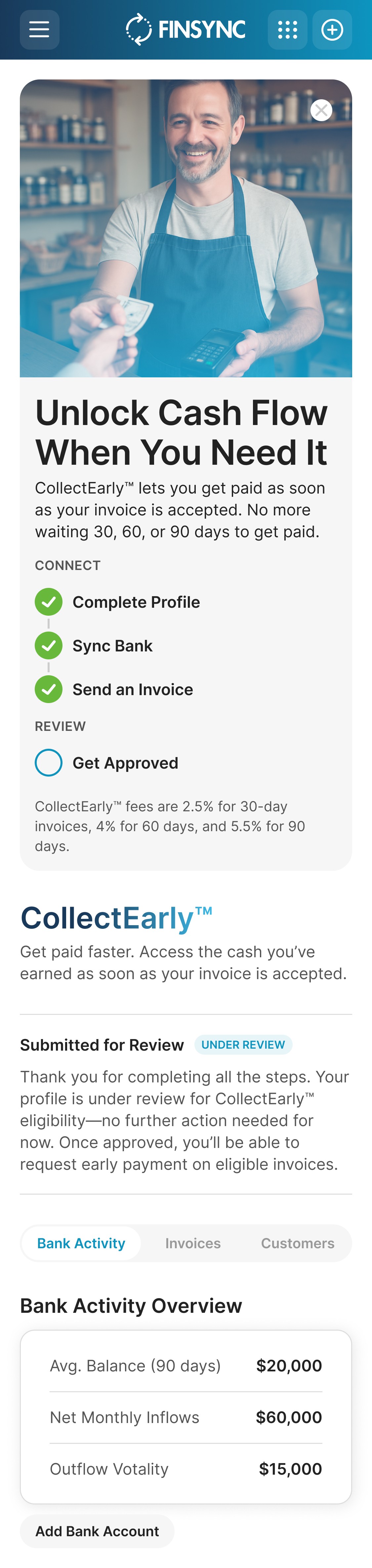
Before taking users through the flow to set up CollectEarly, we provided an up-front explanation of benefits. Each step of set up was also clearly explained with clear CTAs leading them to the appropriate action.
Welcome Screen

Onboarding Step

All-in-one CollectEarly hub
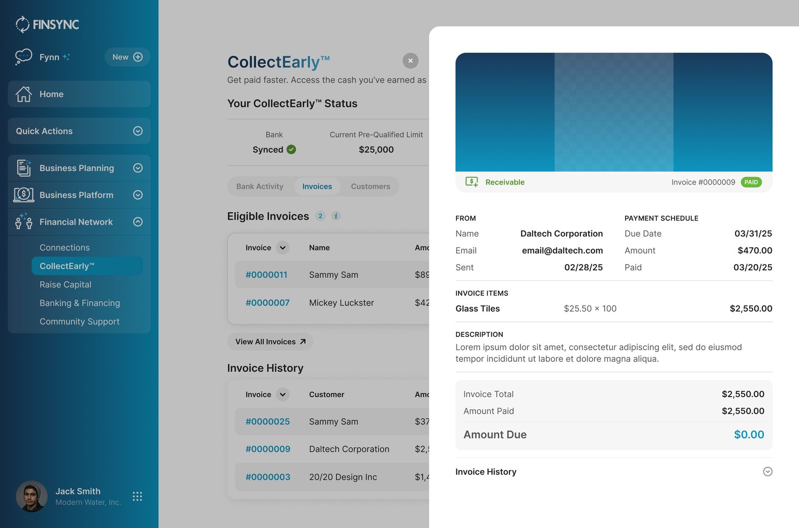
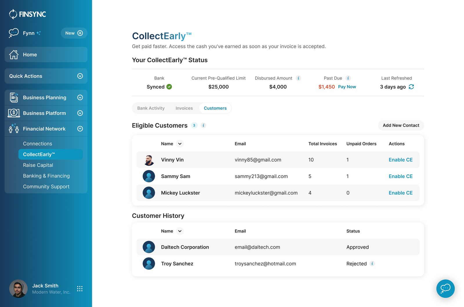
Instead of navigating between multiple pages, users could now view everything in one place. This included invoice eligibility, customer information, credit limits, and outstanding payments.
By centralizing this information, users no longer had to piece together their status across the product.
Default view
On scroll
Linked Bank Activity Overview

View Invoice
Apply CollectEarly to Invoice
View Customers
Mobile screens
A significant portion of CollectEarly users accessed FINSYNC on mobile. Each screen was designed to scale cleanly to smaller viewports, ensuring clarity and consistency while users waited for underwriting approval.


Results
Outcomes


Conclusion
CollectEarly reinforced the importance of clarity when designing financial tools. By simplifying onboarding and presenting credit information in plain language, we helped business owners move faster, trust the system, and access funding when they needed it most.
More projects


