
Costco In-Store Navigation
Reimagining the Costco mobile experience to make in-store shopping faster and more intuitive.
Concept
Mobile App
Background
Problem overview
A world-class in-store experience that did not translate digitally.
Costco’s stores are known for quality, value, and discovery. Yet the Costco app, rated only 2.2 stars on the App Store and 3.2 on Google Play, had become a source of frustration for members. Frequent crashes, confusing layouts, and missing features left users calling it one of the worst e-commerce apps from a major retailer.
Unlike competitors like Sam’s Club, which offered Scan-and-Go and robust in-store features, Costco lacked a digital experience that matched its in-person reputation.
Our goal was not to redesign the app entirely but to identify a high-impact feature that could make the in-store journey smoother and more rewarding.
The opportunity
We saw an opportunity to close the gap between Costco’s physical and digital experiences.
Through member feedback and competitor analysis, we identified in-store navigation as a missing feature that could help shoppers plan efficient trips, locate items faster, and save time at checkout.

We envisioned a digital shopping companion that would guide users through the warehouse, connect to their digital lists, and make every Costco visit easier and more enjoyable.
Constraints
Our concept sprint lasted only two weeks, including design and development time.
Design and backend work had to be finalized in the first week for developers to build the prototype.
No formal Costco design system was available, so we created a lightweight style guide from public brand assets.
Because this was a conceptual project, we could not collaborate directly with Costco stakeholders.
What I did
My role
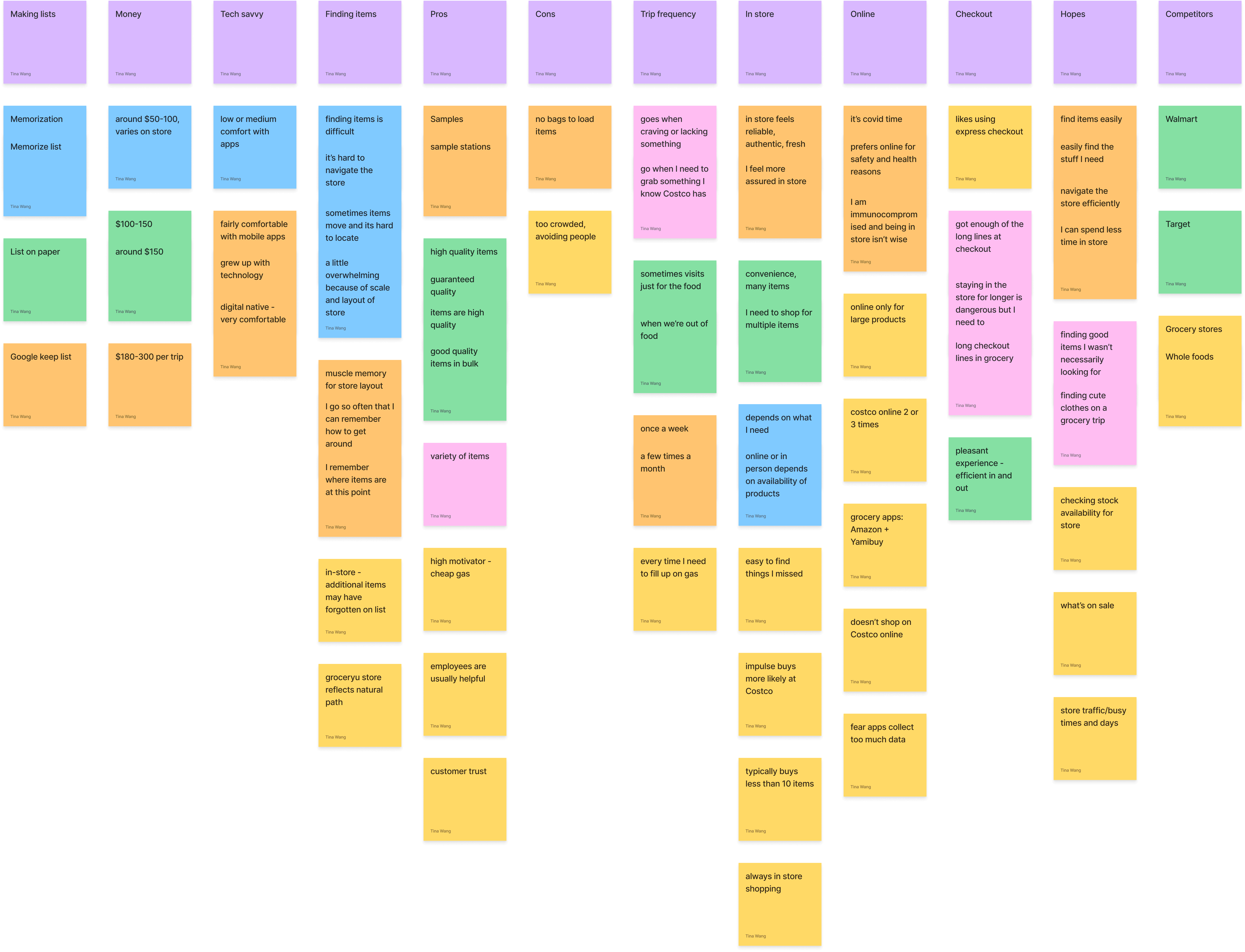
Led interviews and synthesized findings into affinity diagrams.
Created low-fidelity wireframes and conducted A/B testing on navigation flow.
Built the style guide and coordinated consistency across the design team.
Produced the high-fidelity prototype and connected it to the in-store navigation concept.
Conducted usability testing and synthesized feedback into actionable refinements.
Process & Artifacts
Research and discovery
We interviewed four Costco members to understand their shopping habits and frustrations.
Findings
1
Members loved the Costco experience but disliked the app’s reliability and usability.
2
Most spent over $100 per trip and valued the freshness and variety of in-store shopping.
3
The biggest pain points were finding items and long checkout lines.
4
Shoppers wanted to plan routes and track lists without getting lost in the warehouse.
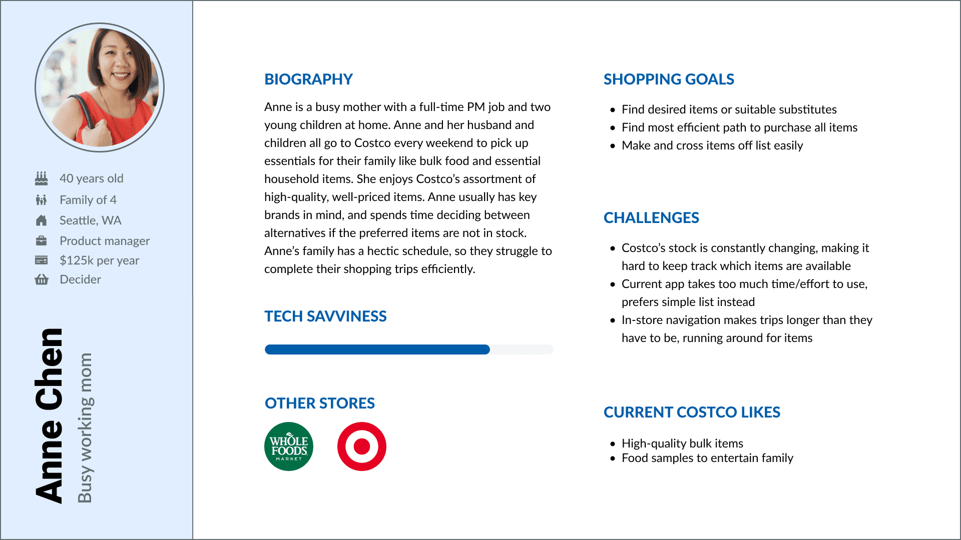
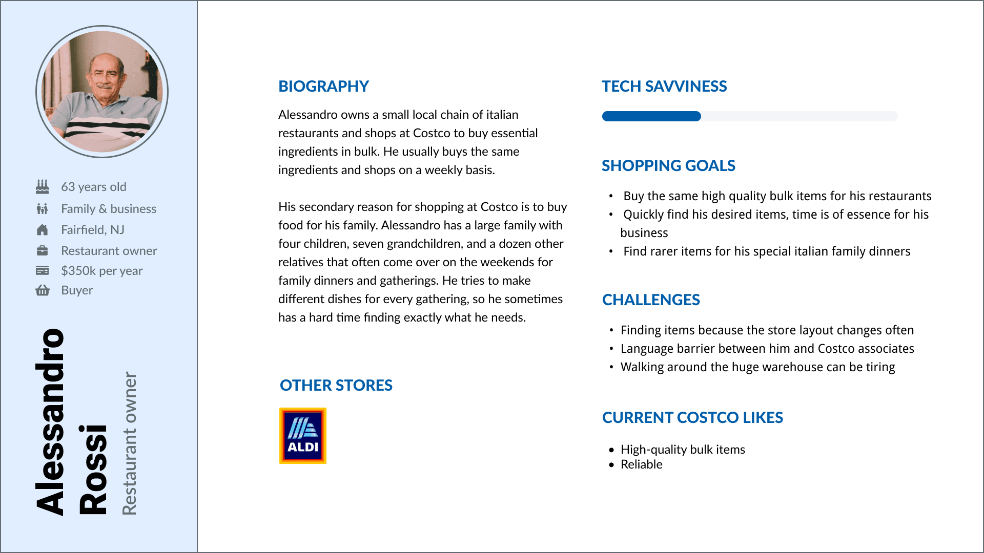
From these findings, we created two representative personas: a busy parent managing family shopping and a restaurant owner buying supplies in bulk.
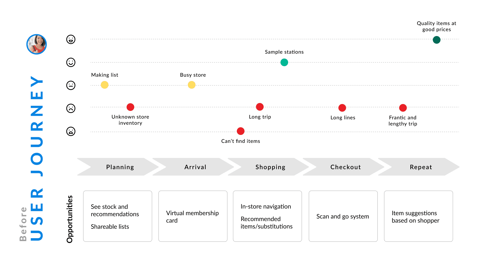
User journey & personas
Anne Chen - Busy Working Mom
Alessandro Rossi - Restaurant Owner
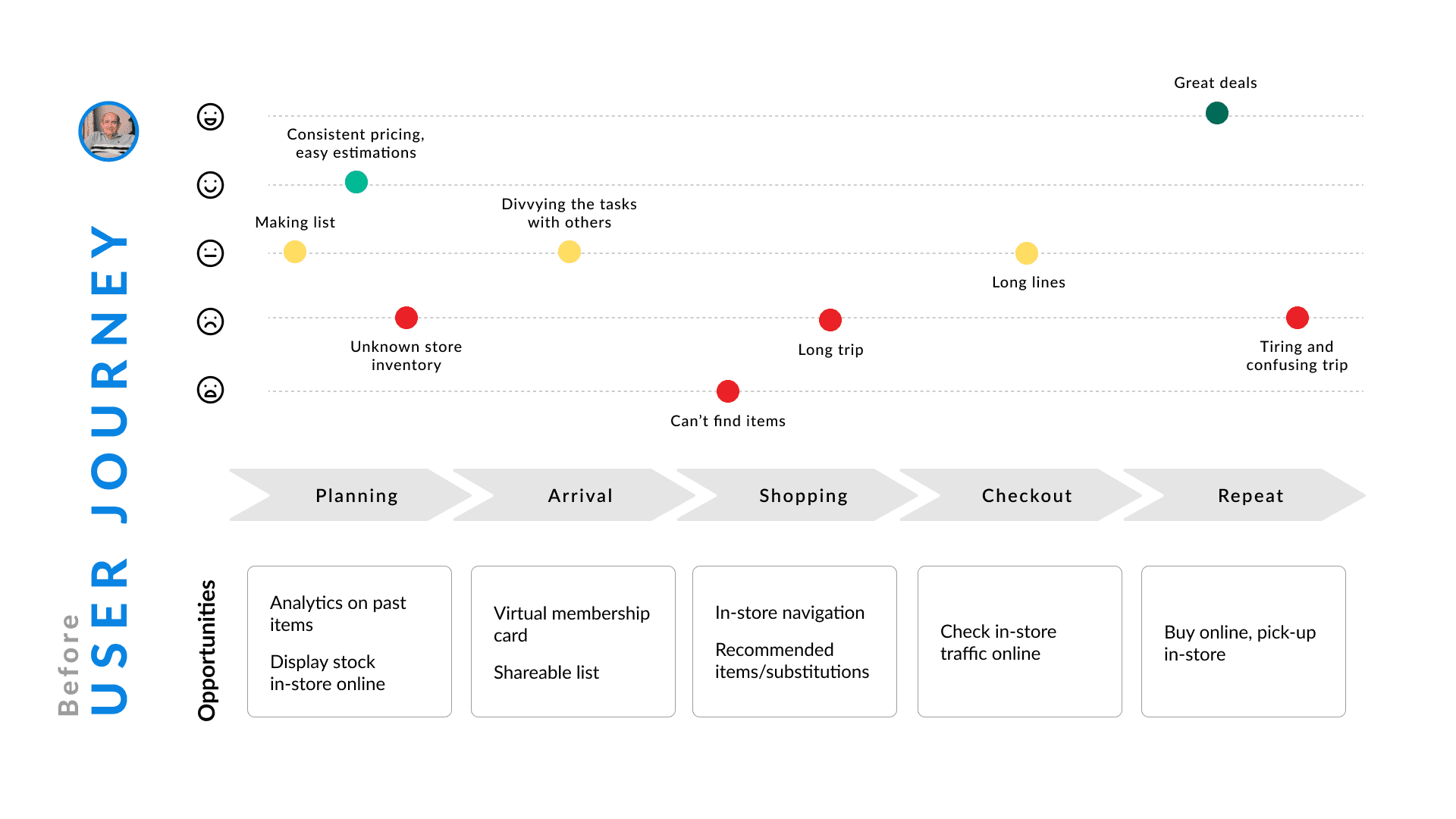
Mapping each persona’s trip from planning to checkout revealed consistent friction at three stages:
1
Planning
Shoppers lacked a clear view of inventory and substitutions.
2
In-store navigation
They spent too long searching for items.
3
Checkout
Long lines added frustration to every trip.
We focused our efforts on the navigation phase, where the opportunity for efficiency and delight was highest.
Iterations & design process
Sketches
We began with quick, low-fidelity sketches to explore navigation flows and layout options.
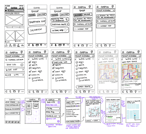
Wireframes
These ideas evolved into low-fidelity wireframes tested through informal A/B sessions with early users. We refined the flow around the shopping list and map features to minimize screen switching.
Style Guide
To ensure consistency across the team, I created a simple style guide defining colors, typography, and reusable components.

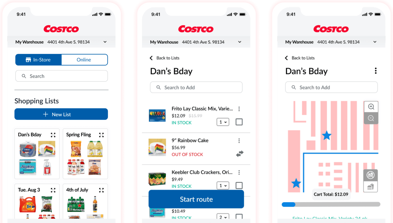
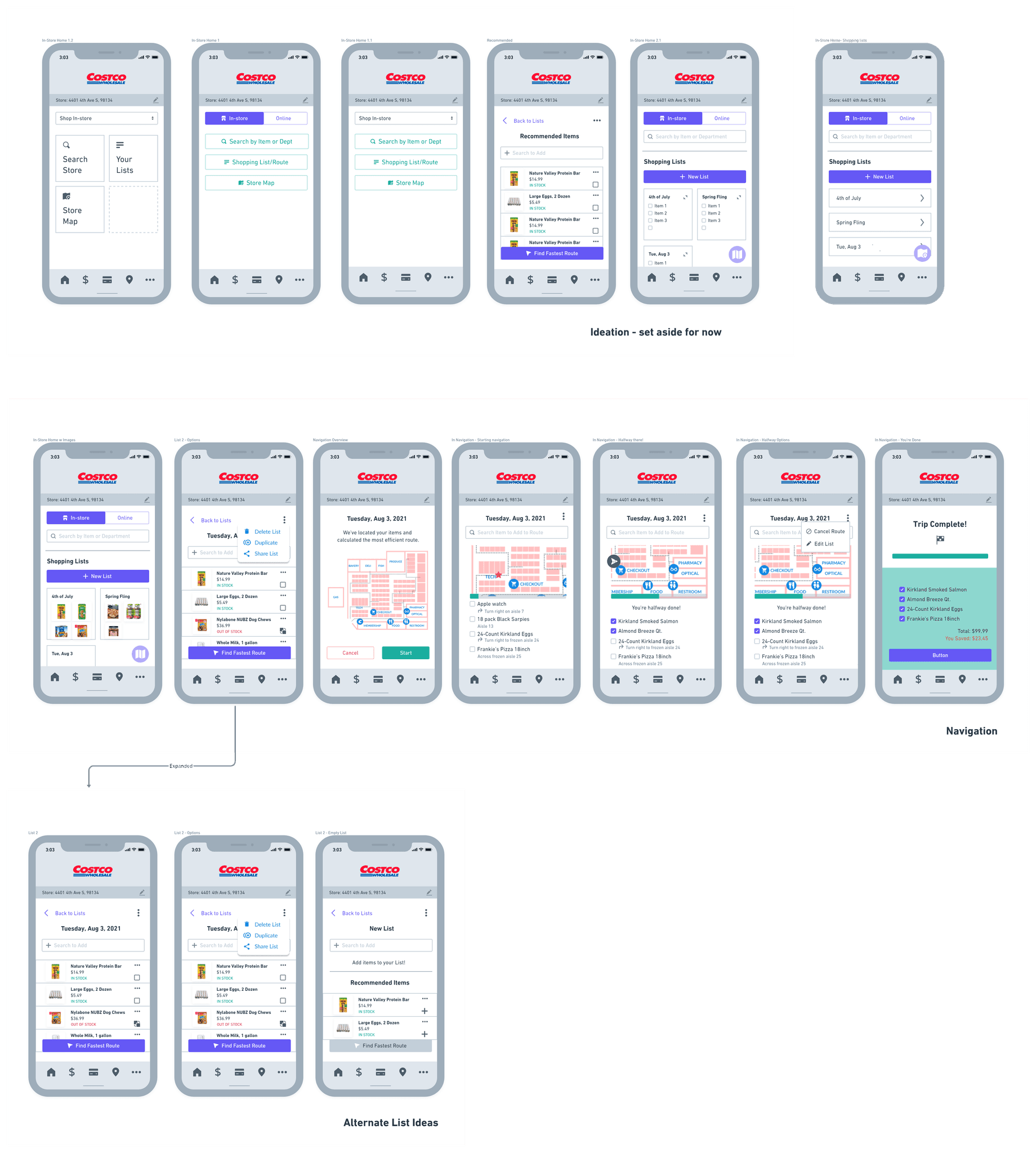
High-fidelity prototype
The final prototype introduced:
A guided shopping route based on the user’s digital list.
Search and filtering options for locating products in-store.
An onboarding sequence introducing the new feature.
Updated visual hierarchy and color palette for clarity.

Usability Testing
We tested the prototype with six Costco members.
Positive feedback
Users found the interactive map useful both at home (for planning) and in-store.
The progress indicator added a sense of momentum and accomplishment.
Areas of improvement
Onboarding language was too technical for some users.
The map lacked details like sample stations and aisle numbers, reducing precision.
Conclusion
This concept showed how small, focused improvements can make a large impact on brand perception and user experience. By bridging Costco’s in-store experience with a modern mobile feature, we reimagined how members could navigate, plan, and enjoy every trip with ease.
More projects


